People often ask for a look at how we make the videos. When we were putting together the the "Electing a US President" video, I made a special point to take photos of the process. Here's how it works:
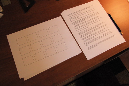
Every video starts with a script. If there is "secret sauce" it happens in writing the script because the script drives the video. We use Google Docs to collaborate until we feel like the script is close to finished. Then, we start looking at a thumbnail storyboard.
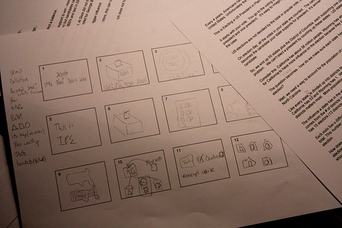
I draw the scenes for the thumbnail storyboard. It's our first attempt to represent the visuals.
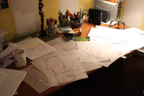
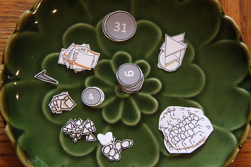
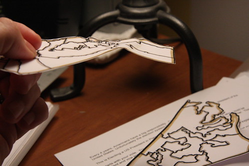
After a couple of rounds of thumbnails and lots of talking between us, we make a list of all the elements that need to be drawn for the video. At this point, I start drawing and digitizing the images. Of course, with the maps in this video, I resorted to tracing.
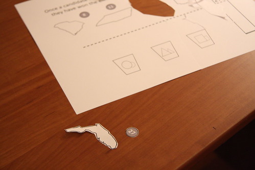
Once the images are drawn and digitized, we set up a new storyboard using purely digital images. This way, we can manipulate sizes easily and see how everything fits together. Once we feel confident, we print out the materials and start cutting and coloring.
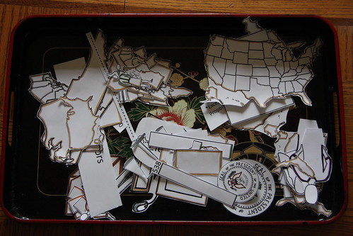
Sometimes, we leave things laying around and our dog decides to put them in his mouth.
Before shooting the video, we assemble all the materials and take them to the studio. We iterate at every point in the process. The script and visuals change every day.
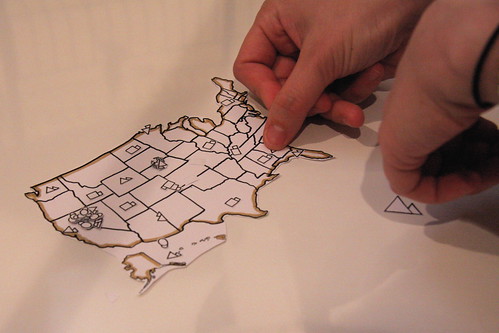
Once production begins, we follow the storyboard and slowly lay out each scene. Often, scenes are revised on the fly. You can never really see how it will work until you see it on the screen.
Each video is different. Sometimes we go down a road, only to find a dead end. We are both prepared to throw away our work and start over if it doesn't feel right. It's painful, but necessary.
Sachi takes over control once we get to the studio. She runs each scene, the camera, lights, etc. She manages the voice-over and all the post production work. Editing is a huge part of what makes the videos work and those decisions are Sachi's. While she's doing that, I start this process over for the next video.
All these elements come together to create this video (on Vimeo, YouTube and dotSUB):
Subscribers to the Common Craft Blog may have seen a strange message today about licensing that included the line "Your application will be reviewed."
This is a mistake - you should not have received this message. We created a new page and for some reason, the introduction on that page got included in the messages that go to subscribers. We'll make sure it doens't happen again.
Sorry to confuse you - we'll be back to normal programming this week.
As you may have seen, the Common Craft Store has a section for merchandise that is looking pretty minimal at the moment. At the same time, we often get requests for t-shirts. Hopefully, we're about to solve this problem.
We've created a new "assignment" on a website called Pixish. Using Pixish, we can describe an image we need and have a community of creative people submit their ideas. The creator of the winning images win "rewards" - often money, links, etc.
We're hoping to identify 2-3 images that we can put on t-shirts and other fun things that are offered in our store. If you're creative and want to participate, please do. The details are here.
We're offering $200US to the winners, plus some link-love from this blog. The assignment ends on September 15th.
What would you like to see on a Common Craft t-shirt?
It seems like a long way off, but South-by-Southwest Interactive (SXSWi) is just around the corner (March 2009). At the moment, the public is voting on what speaking panels should be accepted for the event. When the voting finishes (August 29, 2008) the SXSW staff will consider the results of the voting when deciding what panels will be picked.
I say all this because I hope you'll vote for our panel. :) Here are the details:
Description: People are hardwired for visualization yet we rely significantly on text. Most games, graphic novels, magazines, interfaces, IKEA instructions, and many other forms of communication take advantage of people’s natural visual thinking ability. Panelists will discuss how to leverage visual techniques to improve your games, websites, movies, communications, or presentations.
This episode has been downloaded 50,000 times more than any other episide. Why? Because the producers (Ira Glass and Alex Blumberg) focused on explanation instead of information.
When we talk about our videos, we often say things like "Our goal is to make people care about something. That's the hard part. If they care, they'll go learn the specifics. It's not about how it works, its about developing an interest." It was exciting to this same sentiment about The Giant Pool of Money.
Rosen writes:
I noticed something in the weeks after I first listened to “The Giant Pool of Money.??? I became a customer for ongoing news about the mortgage mess and the credit crisis that developed from it... ‘Twas a successful act of explanation that put me in the market for information.
He continues with an example that I think frames exactly what's happening with Web 2.0:
For there are some stories—and the mortgage crisis is a great example—where until I grasp the whole I am unable to make sense of any part. Not only am I not a customer for news reports prior to that moment, but the very frequency of the updates alienates me from the providers of those updates because the news stream is adding daily to my feeling of being ill-informed, overwhelmed, out of the loop.
Sound familiar? People are feeling left behind everywhere and it's because we are assuming too much and not thinking about the masses that need what Rosen calls the "scaffold of understanding" - the big picture that gives people the context they need to be interested. This is our goal and one that I hope others adopt.