Tools for Better/Faster Reading

In my research on accessability, I came across new reading systems that are fascinating. They may not be your best bet for all videos, but you may find them useful in other parts of your life.
Speed Readers
What if you could read without moving your eyes to follow the words in a sentence? What if, instead, the words appeared, one at a time, in a single location? Let's take a look...
I used this free app by Spreeder to display the paragraph above in this format:
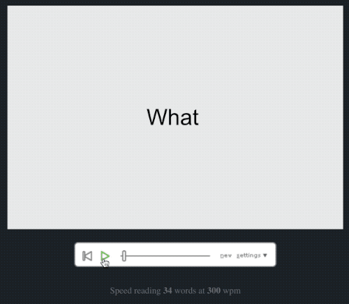
This is often referred to as Rapid Serial Visual Presentation or "RSVP". The format has been shown to increase reading speed, but may not be the best for comprehension compared to static text.
Other RSVP tools:
- AccelaReader offers a free web-based tool
- Outread is an iOS app that can be applied to web pages and documents
- Sprint Reader is an extension for Google Chrome
Bionic Reading
Bionic reading is a proprietary tool developed by a Swiss developer named Renato Casuut. His goal was to make reading easy by guiding the eyes through artificial fixation points.
What does that mean? I've used this free tool to convert the paragraph above into the form of bionic reading:
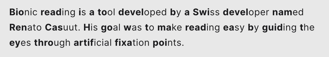
The big idea: Your brain has memorized most of the words you see. To recall the word and its meaning, you don't need to see the whole word. By bolding the first few characters, we can read in a slightly different way.
While there isn't definitive evidence that Bionic Reading is faster or increases comprehension, it does seem to work better for people with ADHD and/or dyslexia. More.
Dyslexia Font
Speaking of dyslexia, designer Christian Boer created a font called Dyslexie that is specially designed for people with dyslexia. It enhances the ease of reading and comprehension. Example:
As you can see, the blue typeface above is weighted differently. The letters have heavier bottoms and longer sticks, which is the straight part of a letter like "P".
These tools are not a solution for everyone. However, they provide a look at new approaches to something we can easily take for granted: reading. Your best bet is to experiment and see what works for you and your use cases.
